Bill Schaffer AIFD, AAF, PFCI & Kristine Kratt AIFD, PFCI
On December 14, 2018, we received a follow-up e-mail from the Commercial Director of a major Importer and Exporter of flowers in Holland. He was finalizing his company’s exhibition at January’s IPM ESSEN 2019: The World’s Leading Fair for Horticuture. We were completing design ideas and floral needs for the entryway to their space that we would be creating. In this e-mail, he asked what we thought of creating the installation using (at that time) the 8-day old, hot-off-the-press release of Pantone’s 2019 Color of the Year: PANTONE® 16-1546 Living Coral. He immediately followed that thought with, “no idea if we can find a good assortment”.
A leading Dutch Flower supplier for the world was not certain that there would be the volume of coral-colored flowers to create the design that he wanted. A new trend color coming into the market is sometimes a challenge. Flower farms throughout the world will not have enough time to plan, obtain the seed crop, plant, grow and harvest enough coral-colored flowers before 2018 is over.
So where does Living Coral come from? “To arrive at the selection each year, Pantone’s color experts at the Pantone Color Institute comb the world looking for new color influences. This can include the entertainment industry and films in production, traveling art collections and new artists, fashion, all areas of design, popular travel destinations, as well as new lifestyles, playstyles, and socio-economic conditions. Influences may also stem from new technologies, materials, textures, and effects that impact color, relevant social media platforms and even up-coming sporting events that capture worldwide attention.”
Yes, their research does include “all areas of design”, though it does not focus on flowers: WE DO! Pantone did not spend a year and more in research to tell the floral industry what color flowers we should be using. Flowers are our focus, they are how we move through the business of life. What can we do about it? LIVING CORAL does not need to be the featured color in our designs to take advantage of the worldwide marketing awareness of the 2019 Color of the Year. As an accent or in combination with other ‘happy’ colors, Living Coral can be added and marketed to show your trend worthiness for your customers in-the-know. Coral-colored Containers, Linens, Ribbons, Picks, Wraps, Yarns and Wool all offer floral designers a way to use this top new trend color in their everyday creative activities.
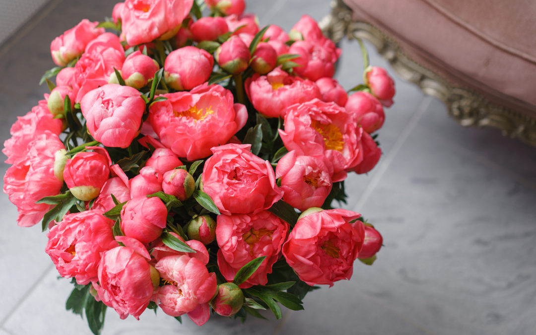
An example of how to use coral this year is shown in our curated Florists’ Review’s 2019 Christmas Trends (December 2018). Coral is used as a focal and as an accent in both trend forecasts CABANA CHILL (Design Master Coral) and CRANBERRY BLISS (Design Master Coral Bright). A quick internet search of Pantone’s color palette for Spring- Summer 2019 reveals Living Coral along with Fiesta (a festive orange red), Turmeric (an enlivening orange), Mango Mojito (the golden yellow) and even more bright, happy colors. Orange is exciting. Peachy-orange is often described as coral; and this is perfect for wedding season.
The all-white wedding that was then infused for so long with blush tones, and then even more pinks; added peach into its collection over the past few years. Living Coral offers the creative floral wedding salesperson an opportunity to suggest enriching their event with coral and dare we say: orange. For those fearless, trend aware brides they can take coral into even bolder and more daring realms. Coral bridges the gap between many color harmonies. It can remain as the softer side of the blush family, or it can turn up the volume all the way to rich red. Expressing one’s individuality while not looking to be like the rest of the social media world can give Living Coral a unique movement in the expected wedding colors.
Originally published in the October 2017 Issue of Florists Review

